


Sargent in Paris: a little too perfect
But with some very fabulous clothes. The show is up at the Met until August 3.


There is something glamourous and a little sexy about Sargent. Portrait painter of the elite, he loved fabulous clothing and elegant settings, and depicted it all with a touch of genius. The Met is emphasizing this allure in their “Sargent in Paris” exhibition with the show’s banner cropped on the glowing, bare shoulders and jeweled straps of Madame X, the portrait that scandalized French society at the 1884 Paris Salon. Overall the works in the show are awe-inspiring, but by the end I was growing bored of the over-perfection. Sargent’s work is beautiful but too controlled, which makes sense in the context of his career and social setting.
Ostensibly American, Sargent was born in 1856 in Florence, Italy to American parents. He grew up in Europe and lived his life between Paris and London, never living in the US and only visiting for the first time at age 20. He was fluent in French, German, Spanish and Italian, and after a false start at the Academy of Florence he moved to Paris at age 18 to study at the Académie des Beaux-Arts. The Académie was one of the most traditional and respected art schools in Europe at the time, and in letters home, his classmates remarked how their peer John Sargent outstripped everyone else. The show at the Met focuses on the 10 years he lived in Paris, when he skyrocketed from being a young art student to becoming one of the most sought-after portraitists of his day.
An extraordinary painter, Sargent was constrained by his own societal success. His stunning and expensive portraits meant his flow of income was strong and his address book full. But being such a society insider — the close friend of countesses and heiresses — constricted his talents to something a little too slick. There’s a rawness and a direct connection to life that’s missing from much of Sargent’s work. Perhaps he was too good a student during his formal academic training: his mastery of line, composition, and color comes at the cost of a freedom that’s glimpsed only when he uses the more spontaneous medium of watercolors, as opposed to his preferred oil paints. I was left wondering what Sargent would have thought of Picasso’s famous quote “It took me four years to paint like Raphael, but a lifetime to paint like a child.”

The Met show starts out with some incredible charcoal drawings from his art school days — works like Light and Shade (1874) are so developed that they feel more like poetic photographs than drawings. But the most moving is a casual pencil sketch of Sargent’s friend Paul Helleu. His depiction of Helleu’s direct and arrogant gaze, along with his elegant, masterfully-drawn suit, hint at the interest in combining clothing and portraiture that would come to define Sargent’s work. I wasn’t the only one who was taken with the drawing — I was startled by the woman next to me when she burst into tears (!), exclaiming between sobs “it’s just so beautiful!”
The most striking are the paintings, and within the paintings I was struck by his incredible skill with the color white. Some painters are drawn to a color and spend their lives trying to understand it: Rothko with red, for example, or Whistler with black. Sargent is a painter of white. Most of the paintings in the show contain a strong element of the color, and the best paintings in the show are built around it. His early experiments with white test the color’s power and ability to ground a painting and draw the eye with an intense contrast, not always with full success. The catch of sunlight on a sleeve in Young Boy at the Beach (1877) or the crests of a wave in Atlantic (1876) are overly intense, but showcase a skill he’d perfect a few years later.
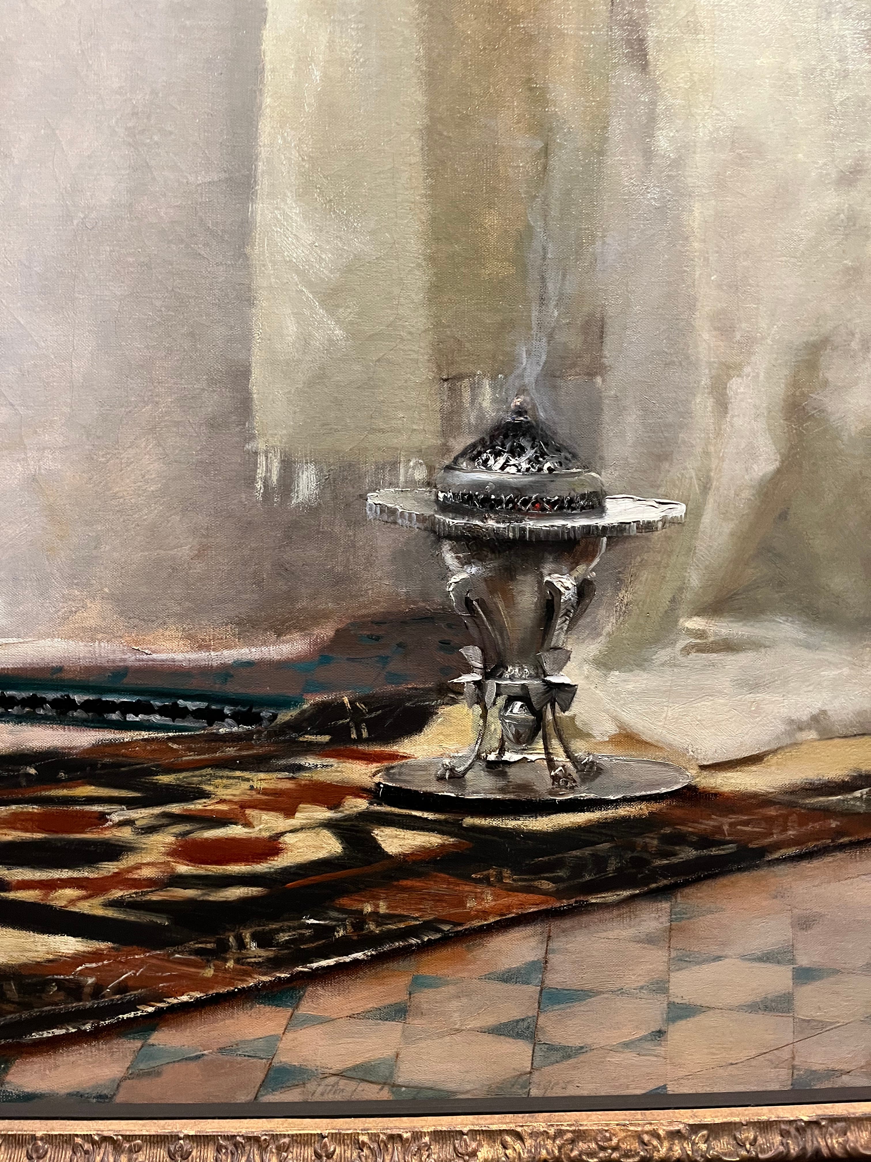
Sargent arrives at fully-fledged virtuosity with Fumée d'ambre gris (Smoke of Ambergris) (1880). The subject itself, a Moroccan woman with incense, is a slightly absurd orientalist fantasy designed to appeal to the colonial mindset of Sargent’s French collectors. But, as the show’s curators are quick to point out, Sargent himself said the painting is about color, and the unusual white against white of the woman’s robes against the architecture is remarkable. The texture of the yellow-white fabric against the smooth gray-white walls is offset by the patterned rug, which all unite around the hard, metallic white of the incense burner’s reflection. The reflection is brighter and purer than the fabric or the walls, and its shine is emphasized by a rare use of impasto: Sargent’s surfaces are usually flat and glossy, and combining the vivid reflection with a sculptural element makes the incense burner the focus of the painting.
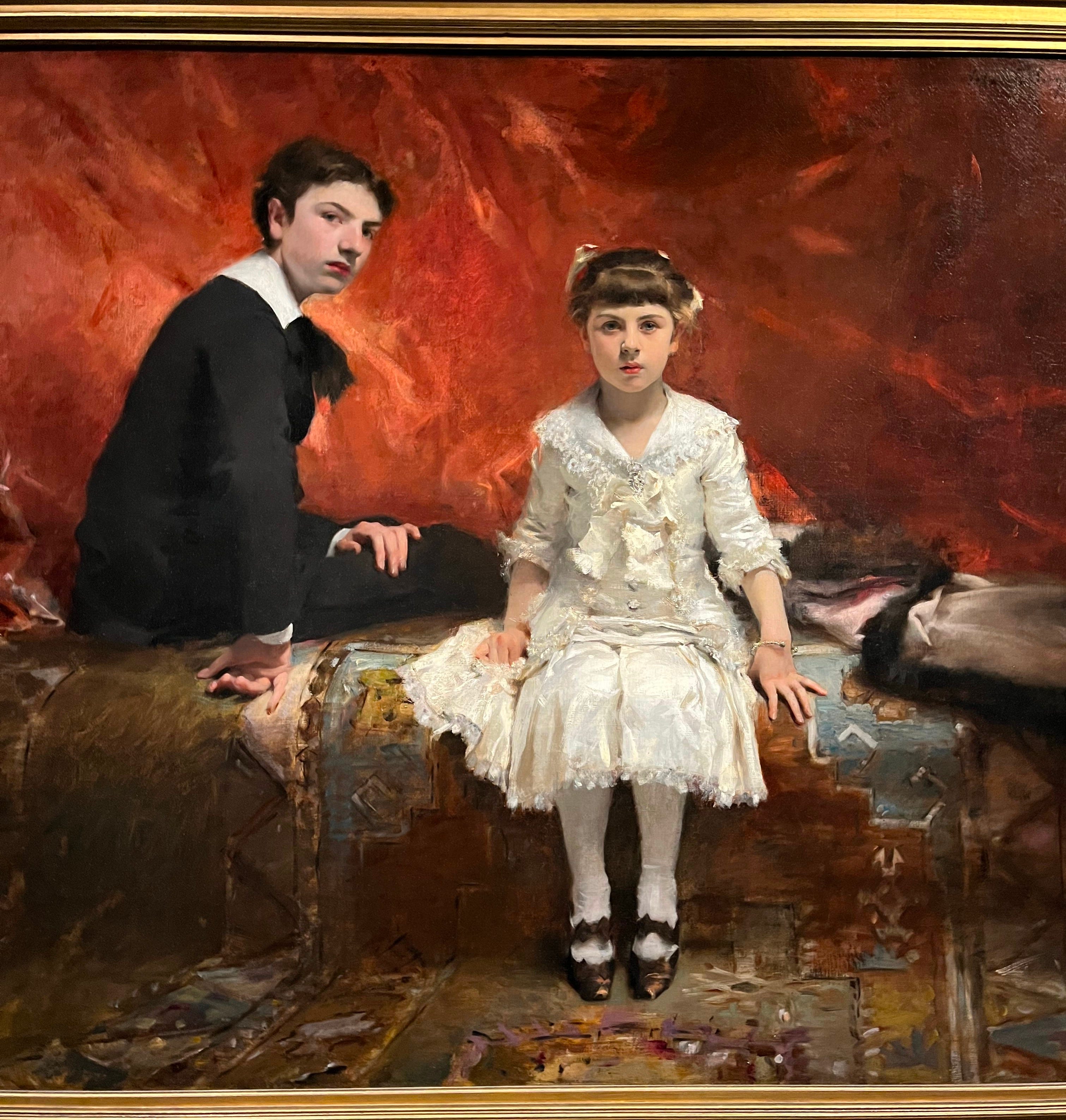
White is not really white but is many colors, gray and purple to pale yellow or green. Sargent achieves the depth of his white objects with an optical trick requiring surprisingly little white paint: what looks like a bright white object is actually just a few daubs highlighting a yellowish dress, as in Edouard and Marie-Louise Pailleron (1881), or a green-gray flower in Mrs. Albert Vickers (Edith Foster) (1884). In Edouard and Marie-Louise, the ten year old Marie-Louise stares out at you with a startling intensity that’s matched by the intensity of her white dress, which seems to glow from within with a ghostly life of its own. The dress is actually light shades of gray and yellow, highlighted with bright white paint in key areas that catch the eye. The child’s fierceness has a pale echo in her older sister at her side, an ancillary character with a timid stare and a black dress swallowed by the surroundings. In Edith Foster, your eye is drawn to the white magnolia gleaming in Edith’s hand rather than to her face or elegant dress. In both paintings, the actual subjects are almost eclipsed by Sargent’s intense interest in experiments with color.


The attention Sargent lavished on his sitters’ clothing rivals the attention on the people themselves. In Dr. Pozzi at Home (1881) the dazzling red dressing gown is the star of the show, taking up the bulk of the painting while elevating Pozzi himself by referencing the red robes worn by Church cardinals. The Sulphur Match (1882) seems more of an homage to a pair of elegant slippers framed by a dress than to the lighted cigarette in question, and the riot of silky fabrics in Margaret Stuyvesant Rutherfurd White (1883) and Madame Ramón Subercaseaux (1880) read like love letters to lace sleeves and ruffled hems. Clothing offered Sargent opportunities to show off his skill and indulge in his interest in color — the reflective shine of satin or the muted luxury of tulle require technical expertise. His focus goes beyond, however, not just in the focus on the fabric’s weight and shading but with the choice of full-length portraiture, which allows maximum canvas space for his sitters’ outfits. And what outfits! If someone recreated and sold them, I think they’d make a fortune.
Part of what makes Sargent so appealing is his mix of photorealistic figures with painterly clothes and settings. The realism with which he paints faces and hands is remarkable — with delicate shading and shadows on their smooth, brushstroke-free skin, the people almost seem to breathe. In their clothing, however, almost as much a subject as the sitters themselves, he’s bold in his use of visible brushstrokes. A swipe of blue or gray dissolves into a paint daub up close, but coheres into the hem of a sleeve or a ruffle on a skirt from afar. The result, a combination of painterly clothing and photorealistic bodies, is a unique blend of techniques.
Sargent didn’t branch out much from his mix of techniques, but what he did he did beautifully. And if nothing else, the Met show is worth seeing for the fantastic styles.
