


My Favorite Belgian Introvert
Léon Spilliaert at Zwirner: not everything is good, but some of it is great (and a bonus show: Anni and Josef Albers and their friend Paul Klee)

Léon Spilliaert is one of my favorite artists. Not everything he did was good, but some of it is truly singular. Spilliaert’s work is quietly breathtaking, a tenebristic northern mix of Germanic solidity and Scandinavian isolation. I’ve always wondered why he’s not more of a household name in the way of Munch or Magritte. Maybe because he was a reserved, sickly Belgian man who avoided the art scenes in Paris or London, preferring to stick to the empty landscapes of his native country.
Spillaert was born in 1881 in the quiet seaside town of Ostend, Belgium, where he lived much of his life (artist James Ensor also called the city home). The show at David Zwirner, up until April 12, focuses on his years in Ostend between 1900 and 1920. Half of the exhibition is portraiture, ghostly figures in dark watercolor and gouache, but the best works are his cityscapes. Using large, simple forms and a limited color palette they are reminiscent of woodblock prints or illustrations, but the works’ simplicity belies their depth of feeling.
Ostend is a character in Spilliaert’s work, just like Paris is for Caillebotte or Manet. While technically a beach town on the North Sea coast, it’s a beach town without much heat or sunlight, and the long, empty seaside promenades that stretch into darkness have nothing to do with our usual association of a boardwalk. It’s never summer in Spilliaert’s Ostend, and it’s never daytime. But while eerie, intriguing, and melancholic are all words that apply, it’s somehow never depressing. Instead, the works feel like a quiet contemplation of an inner life — and we all know it’s not always summer inside.

Hofstraat à Ostende (1908) and La Courbe de la digue (1908) both depict single lampposts dwarfed by dark landscapes. Swathes of dark buildings and clouds shift around the tiny light, its persistent glow very small in the huge shadows, yet somehow the paintings feel restful rather than lonely. Much lonelier is a work like Edward Hopper’s Nighthawks (1942), with the spike of human alienation as the figures sit in isolation together. All alone in Ostend, though, the works conjure up a conspiratorial feeling, just you and Léon silently roaming through the deserted town’s avenues and promenades. (I imagine this is what Proust’s Balbec would have been like in winter…)
Spilliaert’s control is masterful, the brushstrokes evoking looming clouds or water fading into night with a simplicity that’s hard to achieve using fast-drying watercolors and India ink. He uses the texture of the paper itself to add another dimension, letting the rough grain show to invoke the haziness of reflected light. The shading animates what are otherwise uncomplicated shapes, landscapes reduced to their purest forms: up close they dissolve into abstraction, but step back and the smooth ribbon is actually a strip of ocean or walkway.

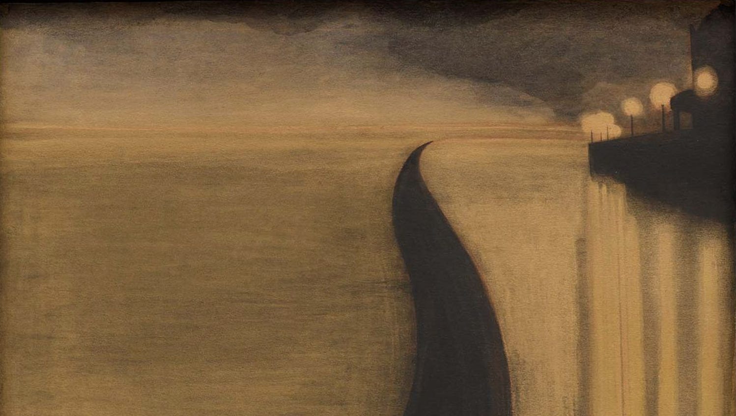
The most arresting work is Digue et Lumières d’Ostende (1909). A plain black stripe curves away from the viewer into a point that coheres into a pathway along the water. The yellow water below the path reflects pale lamplight from a boathouse. There’s nobody there. The whole work uses only yellow, black, and grey, but you feel the twilight of the atmosphere, and the glowing lamppost-orbs are mesmerising and otherworldly. Sometimes this otherworldliness veers into surrealism — in Digue et Kursaal d’Ostende (1909), for example, a pavilion appears like a UFO landing on a distended, empty beach, and it’s easy to imagine the beach populated by Magritte’s weird bowler-hatted men. But it’s the less surreal works like Lumières that are more mysterious, leaving something to the imagination than the obviously strange works like Kursaal.
Part of the appealing mystery in the strongest works are due to Spilliaert’s northern palette of blacks and browns. When he does venture into color the results are a little odd — muted, flat, and not particularly appealing. The blues in Le Mât (1914), a cropped view of a ship’s mast against a bright sky, feel unnatural and cold. Compared with the soothing, melancholic blue-black in Digue et Phare (1908), which draws you into the lone woman contemplating the water at what seems like the end of the earth, Le Mât is anxious, like forced jollity. In the portrait room, the sole colorful work La Couture (1917) is forgettable, especially when compared with alluringly ghostly, dark-toned portraits like Dame au pince-nez (1907) or the positively haunted Autoportrait (1908). His watercolors of trees mix color and dark tones, and are also less successful (maybe that’s why Zwirner hid them together in a side room). But while not everything he did was a triumph, the cityscapes with their lighthouses, promenades, and empty avenues are worth coming back to again and again.


Anni Albers, Josef Albers, and Paul Klee


On the ground floor of the same gallery is a very different show on the friendship and overlapping artworks of three 20th century giants: Anni Albers, her husband Josef Albers, and Paul Klee (up until April 19). Affinities, the title of the exhibition, is a friendly concept — an informal, less severe way of tying artists together. The three artists, who overlapped at the Bauhaus, shared an interest in grids and color theory that each explored in their own way. The Anni Albers textiles are beautiful, and the best pairing is her work Development in Rose I (1952) with Klee’s Monument in Arbeit (1929), both of a similar size and pink-gray color palette. Northern Wintry (1923) by Klee is also a favorite, with pistachio and blush-colored squares bordering a grid, and a welcome departure from Klee’s beloved muddy browns.
The anecdote at the beginning of the show details a journey Anni made as an elderly woman to see a Klee show, made difficult because of her age but something she felt compelled to do by her love of his work. The sketch of that effort and the title of the show makes me want to revisit the book Affinities by Brian Dillon, a wide-ranging exploration of why we’re drawn to different types of artwork — what makes us feel a connection to what we like?
And I can safely say I do not feel an affinity for Josef Albers. You can only look at so many homages to a square.
All images courtesy of the rights holders and David Zwirner
Great Review!