Americana, Advertising, and Ed Ruscha's Optimism
Ed Ruscha's early paintings are strange and sweet. MoMA's retrospective on the painter is worth a visit.
“What a Californian artist” might be one of your first thoughts when you enter the Ed Ruscha retrospective at MoMA. After all, what is Southern California but advertising, car culture, and a blank slate for dreams?
Ruscha famously arrived in LA in 1956, having made the drive in a Ford from his hometown of Oklahoma City. What could be more American than a 50’s small town boy, taking a road trip in a US-built car with dreams of making it in La La land? His early works are born directly from these Americana dreams. Originally hoping to be a commercial sign painter and with early training in graphic design, his creative roots tie him to the grand American tradition of Advertising: making visuals not for their own sake, but with an intention to sell.
Much of the advertising in LA is built so you can see it from the car — that’s where billboards and big neon signs with flashing arrows pointing you to a diner or drive-in come from. The form of these ads made their way directly into Ruscha’s early paintings; big canvases of single words like ACE, HONK, SPAM, ANNIE, SMASH, WON’T, and NOISE that could be plucked straight from the side of the road, a little slice of a bigger advertisement.

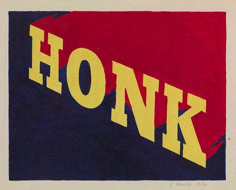
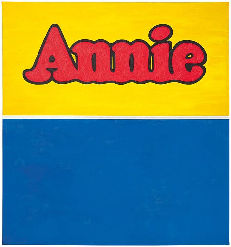
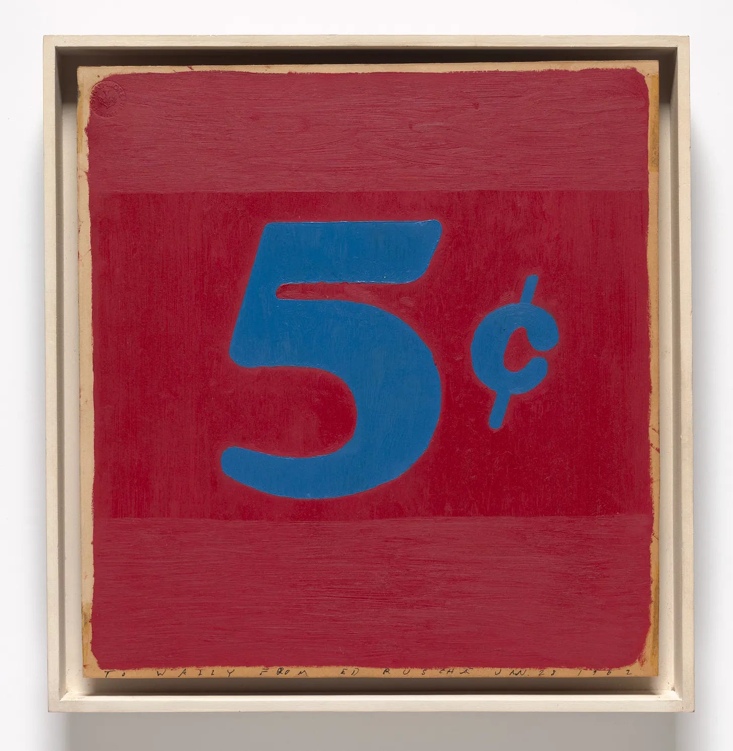
There’s something so satisfying about Ruscha’s early works. They are simple and bold. They make you think of childhood. They make you think of America. They make you think of advertising, and cartoons. They recreate that childhood sense of not quite grasping what the adults are up to, but getting enough to know it might be very silly. You don’t need to understand all the words of an advertisement to know that it wants you to buy something, to HONK or make NOISE or just OOF. And they must have been pleasing to create; Five Cents (1962) brings to mind a sophisticated coloring book. But beneath the big letters they are complex. The works’ simple outlines stir up thoughts about our nation’s particular brand of dreaming, what it’s like to be a child in this country, and how advertising infantilizes adults. And when it comes to what’s actually on the canvas, the works’ graphic simplicity makes you question notions about “design and illustration” vs “fine art.”
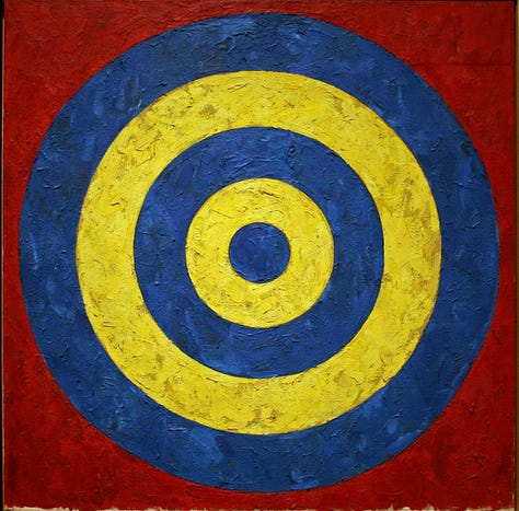
Graphic design and illustration are kept firmly separate from fine art by the powers that be, but design/illustration is a natural starting place for an artist as a place to experiment with form and color (and also pay the bills). Yet it takes a truly big name to combine the two in a way that’s palatable to the art establishment. Ruscha’s not the only one who started as a commercial artist — Barbara Kruger, Andy Warhol, and Jasper Johns are just a few examples of artists with roots in the commercial and graphic design world (Johns was a contemporary of Ruscha, and the colors and simplicity of Johns’ 1958 painting Target are too similar to Ruscha’s 1962 OOF not to have been an influence). Their practices combine “fine art” mediums like painting and silkscreen with graphic design/illustration elements like word and typeface-based work and images conveying a specific message. Their words aren’t handwritten, but are made for eyes used to machine-made typography.
It’s a line that gets only blurrier in today’s social media age, as clever creatives like Christoph Niemann and Jean Jullien blur the lines between painting and “fine art,” graphic design, and commercial art with images that see multiple lives on Instagram, in galleries, on magazine covers.


But back to Ruscha, who anticipated these blurred lines with his clear, straight ones.
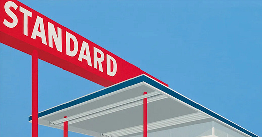
Despite the often negative associations we have with the advertising referenced in his paintings, there’s a startling sweetness to Ruscha — startling because many of his best-known later works are a little sardonic, a little satirical, a little sad. But in his earlier decades, it feels like the optimism of advertising seeped into his works beyond the obvious subject matter. It’s almost as if Ruscha retained the childlike wonder we all felt at enormous, brightly colored signs, cheerful breakfast cereals, or movie posters. Looking at them you simultaneously feel that sense of delight at how big and colorful they are, tempered by the adult suspicion of things that seem too simple. The childhood connection is made explicit by the cartoon westerns that drift through his paintings, like Standard Station, Ten-Cent Western Being Torn in Half (1964) or Noise, Pencil, Broken Pencil, Cheap Western (1963). Perhaps Ruscha spent time, like so many kids, reading cartoons in the back of his parents’ car while they filled up the tank. The act of elevating the 20th Century Fox logo to a full painting has a similar effect. The logo, something most Americans are intimately familiar with, feels like a nod to the way things that loom large in childhood, and which we pretend to forget in adulthood, shape the American psyche — and can still spark feelings of awe and curiosity.
That playful, childlike curiosity is front and center in News (1970), Mews (1970), and Pews (1970). Those are just words that rhyme! The full series also includes Brews, Stews and Dues. When you’re first exploring the world, figuring out how it works, words hold untold magic. Piecing them together or teasing them apart, testing the nuances between words that sound the same but mean different things, is all part of discovering this weird world we live in. And in the Very Serious Adult World, grown men rarely put together nonsensical rhymes just because they sound nice. The fact that these prints are made of food — Hershey’s chocolate syrup, pie filling, bolognese sauce — pushes memories of childhood discovery even further. Don’t tell me you never mixed together the contents of your parents’ pantry just to see what happened.

Ruscha’s intentional whimsy wasn’t happening in a vacuum; the tongue-in-cheek works of Roy Lichtenstein and Andy Warhol come to mind. The childlike feeling about his paintings, though, make you wonder whether he was in touch with Miró, another artist with an odd and sweet sense of humor. Something about the big, solid canvas, unlikely figures, and intriguing title of Ruscha’s Strange Catch for a Fresh Water Fish (1965) brings to mind Miró’s Hair Pursued by 2 Planets (1968). Both paintings point towards the lingering surrealist interests of artists in the 60’s — or maybe both painters just wanted a giggle.
Somewhere in the 80’s, the childlike stopped and the real set in. Of course, not all the paintings before are sweet — Burning Question (1968) is an enormous, beautifully-rendered canvas of LACMA on fire in front of an eerie green glow (after all, LA and the apocalypse have always gone hand in hand).
But the bloody sunsets, unsettling words, and unnerving combinations in works like Friction and Wear (1983) and The Music from the Balconies (1984) hint that Ruscha’s childlike wonder may be evaporating. Now he’s using sentences, not single words. References to the news or the darker side of Americana abound, from the words “The End” in newspaper font (1991) to the bleak “Wen Out For Cigrets N Never Came Back.” Both works, like many others from this period, are drafted in dark, foreboding colors that signal the loss of that colorful optimism. Maybe Ruscha was “growing up,” or maybe he reflected the times as the hopeful 60’s ended and the Vietnam War and social injustice grew larger in the American imagination.
Ruscha’s works are prescient for our quippy, meme-ified culture, prizing bold images that look good on a screen. And while museum merch and IG-friendly painting has its cons, in this painful moment there is something that feels so correct, and so current, about a big ol’ OOF.


